Streamlining UX: Boost Conversions with Clickable Color & Size Selectors
In today's fast-paced digital landscape, ecommerce websites must prioritize seamless User Experiences. One crucial aspect of achieving this goal involves minimizing the number of steps required for users to complete purchases. This blog post will explore how reducing action points can significantly improve conversion rates and customer satisfaction, using the example of clickable color and size selectors instead of traditional dropdown menus.
The Importance of Minimizing Action Points
Minimalist design principles have been gaining traction in recent years due to their ability to streamline processes and enhance usability. By reducing the number of clicks needed to perform tasks, designers can create more intuitive interfaces that cater to modern consumers' expectations of instant gratification.
Clickable Color and Size Selectors
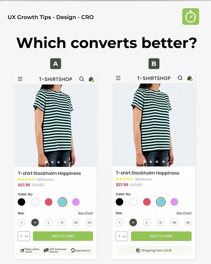
The Instagram post we reference showcases an innovative approach to simplify product selection in ecommerce stores. Instead of requiring customers to open separate dropdown menus for each attribute, the store displays clickable swatches and sizing options directly on the product page.This change eliminates unnecessary interactions, making it easier for shoppers to find what they need quickly. It also reduces cognitive load, allowing users to focus on other aspects of the shopping experience rather than navigating complex menus.
Benefits of Implementing Clickable Elements
By implementing clickable color and size selectors, online retailers stand to gain several advantages over competitors who rely solely on dropdown menus:
- Improved Conversion Rates: Fewer steps between browsing products and completing transactions means higher chances of converting visitors into paying customers.
- Enhanced Customer Satisfaction: Streamlined navigation leads to better overall user experiences, which can boost brand loyalty and increase repeat business.
- Faster Load Times: Eliminating additional HTML requests associated with dropdown menus results in faster loading times, improving site performance and search engine rankings.
Best Practices for Implementation
To ensure successful implementation of clickable color and size selectors, consider these best practices:
- Consistent Design: Maintain visual consistency across all attributes to avoid confusion and promote ease of use.
- Clear Labeling: Clearly label each option to help users understand available choices without needing to hover over them.
- Responsive Layout: Ensure that your interface adapts well to different screen sizes and devices to provide optimal viewing experiences.
Conclusion
As ecommerce continues to evolve, so too do consumer expectations regarding user experience. By following the examples set forth by innovative companies like those featured in our Instagram post, you can stay ahead of the curve and deliver exceptional shopping experiences that keep customers coming back for more. Remember, every small improvement counts when it comes to enhancing UX and driving conversions!


